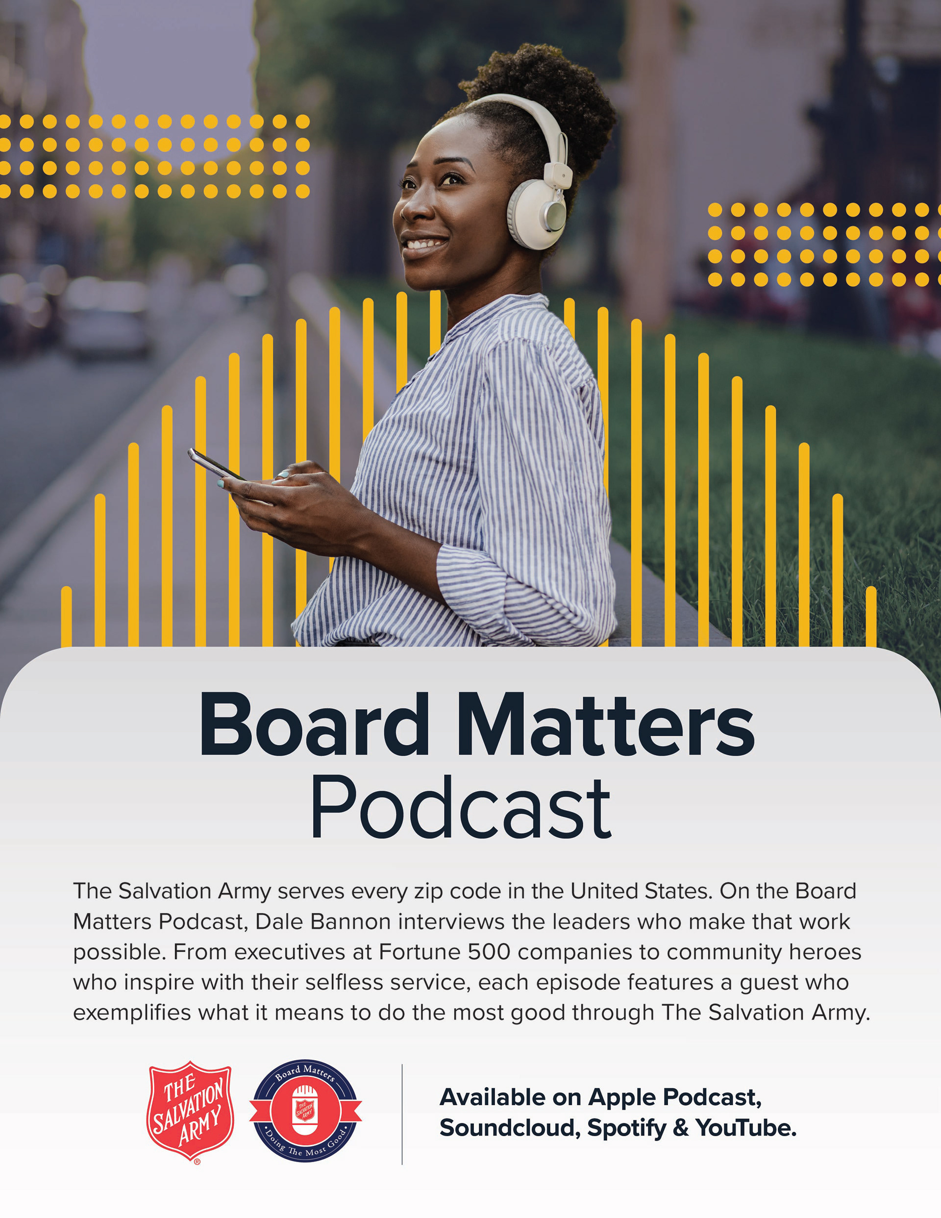
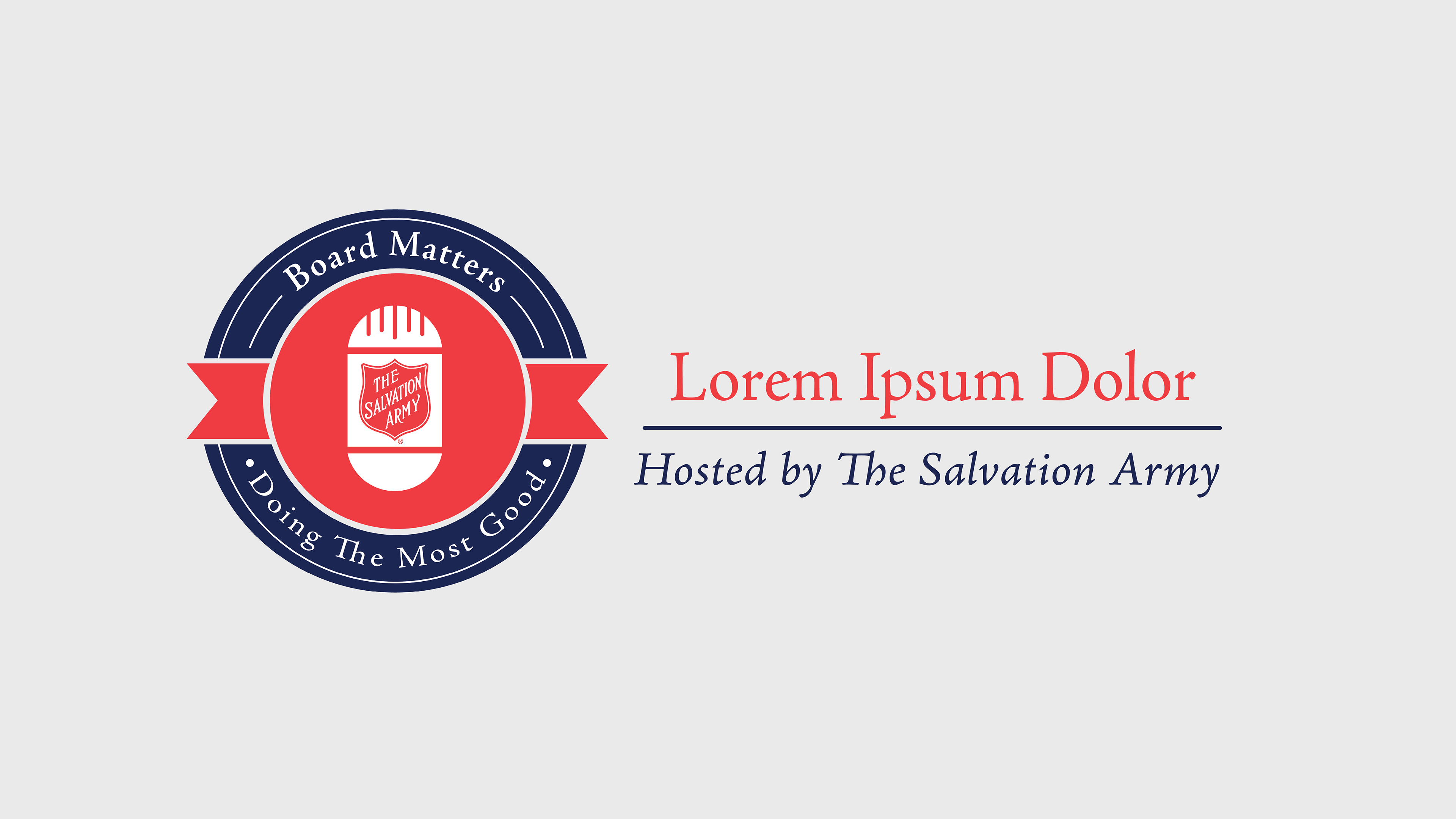
Board Matter Podcast
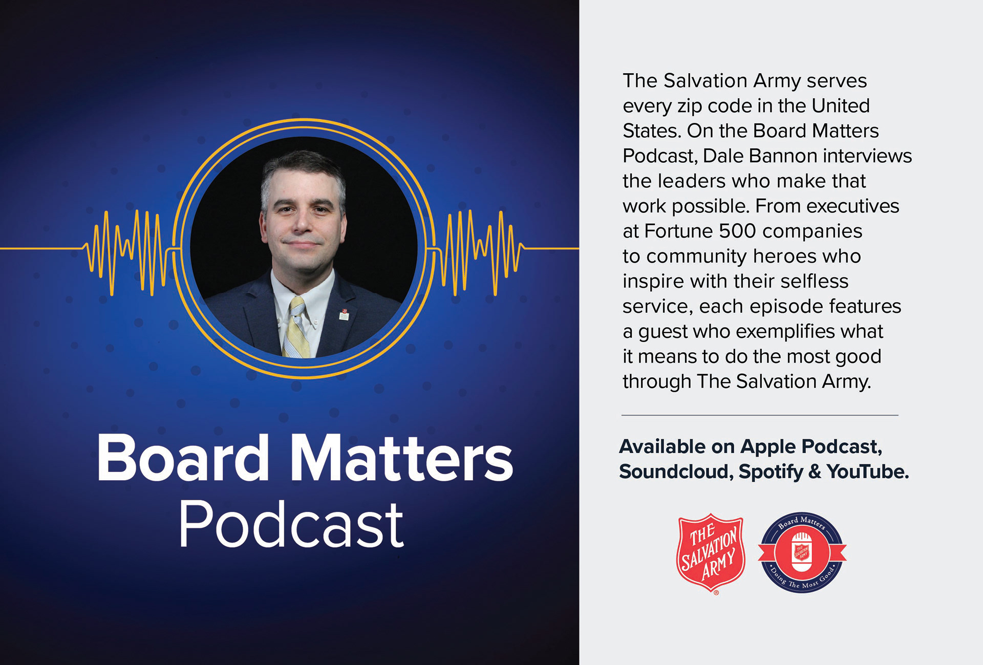
The Salvation Army serves every zip code in the United States. On the Board Matters Podcast, Dale Bannon interviews the leaders who make that work possible. From executives at Fortune 500 companies to community heroes who inspire with their selfless service, each episode features a guest who exemplifies what it means to do the most good in The Salvation Army.
Logo
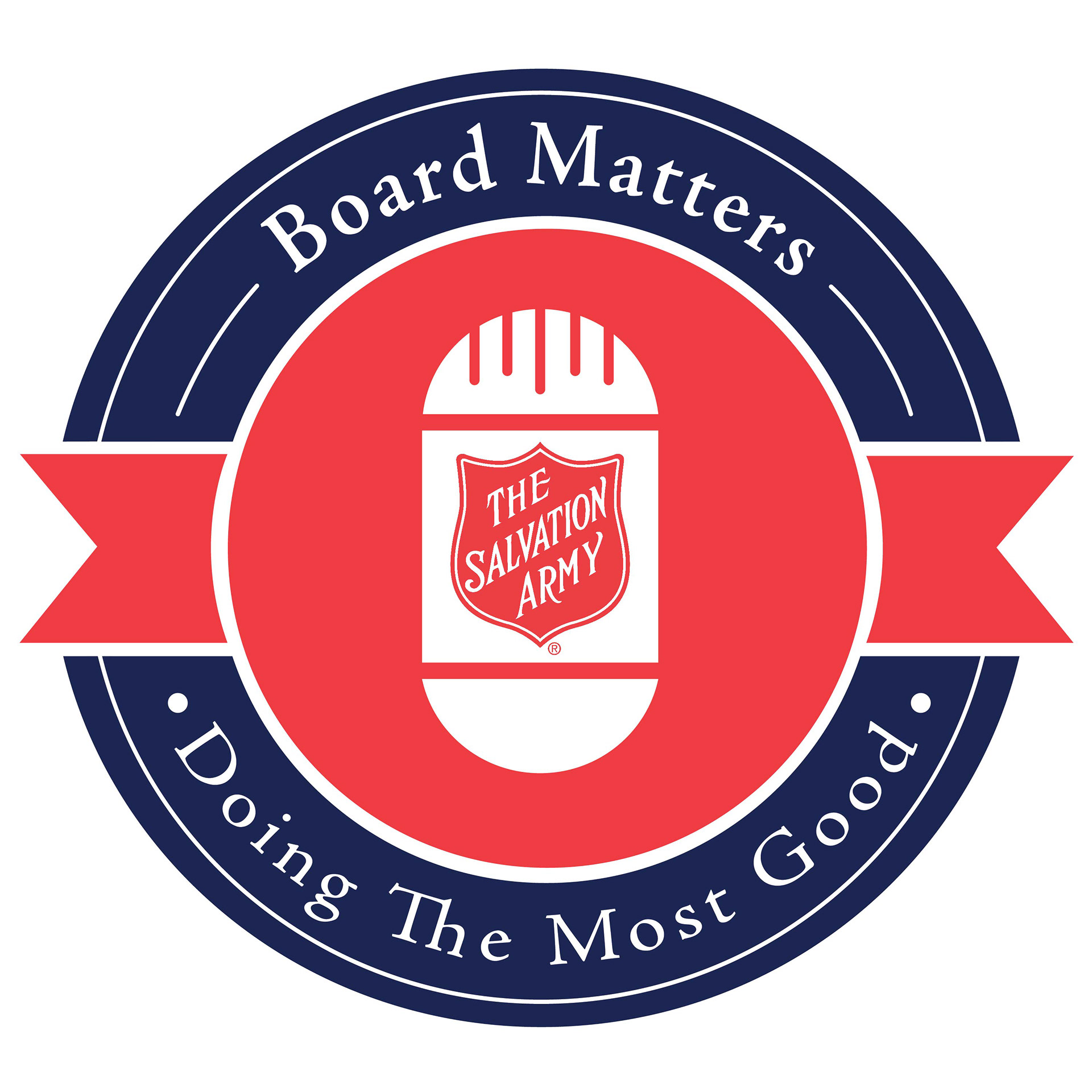
The logo uses a circular badge design inspired by traditional seals and official marks. The microphone at the center represents the heart of the podcast—a place where stories are shared, conversations happen, and voices from the community are brought forward.
The phrase “Doing The Most Good” serves as a mission-driven statement that reinforces The Salvation Army’s purpose and strengthens the connection between the podcast and the organization’s broader identity.
The curved typography follows the circular form of the badge, creating a unified and balanced composition that naturally guides the viewer’s attention toward the central symbol.
The curved typography follows the circular form of the badge, creating a unified and balanced composition that naturally guides the viewer’s attention toward the central symbol.
WARCRY Magazine Ads
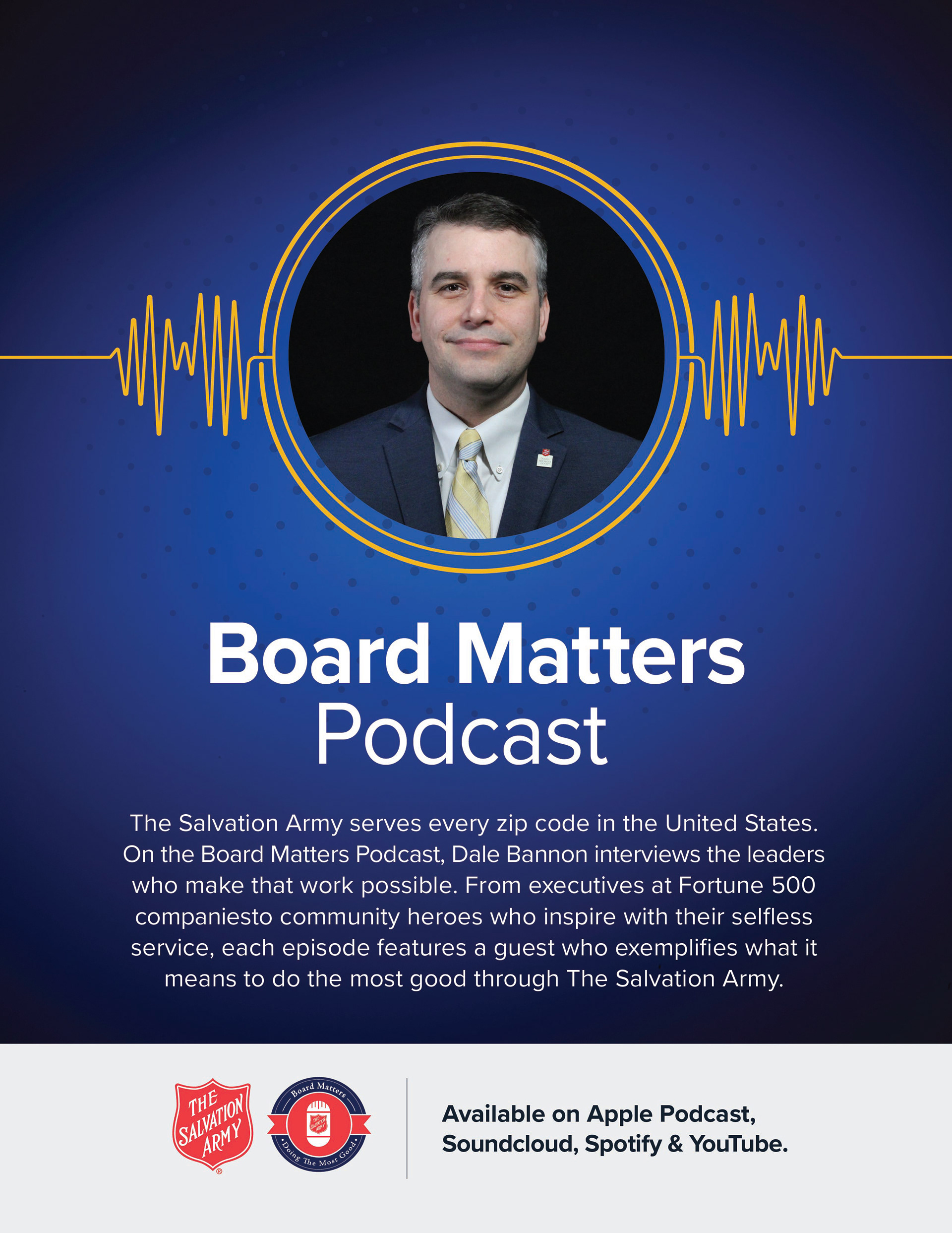
8.25” x 10.75”
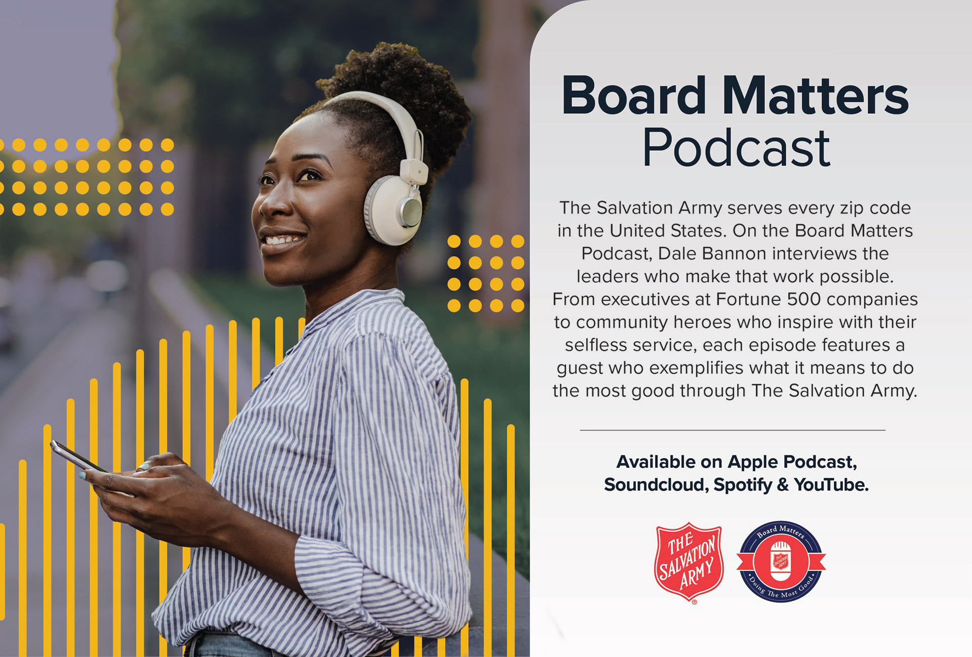
8" x 5.25"
Social Post
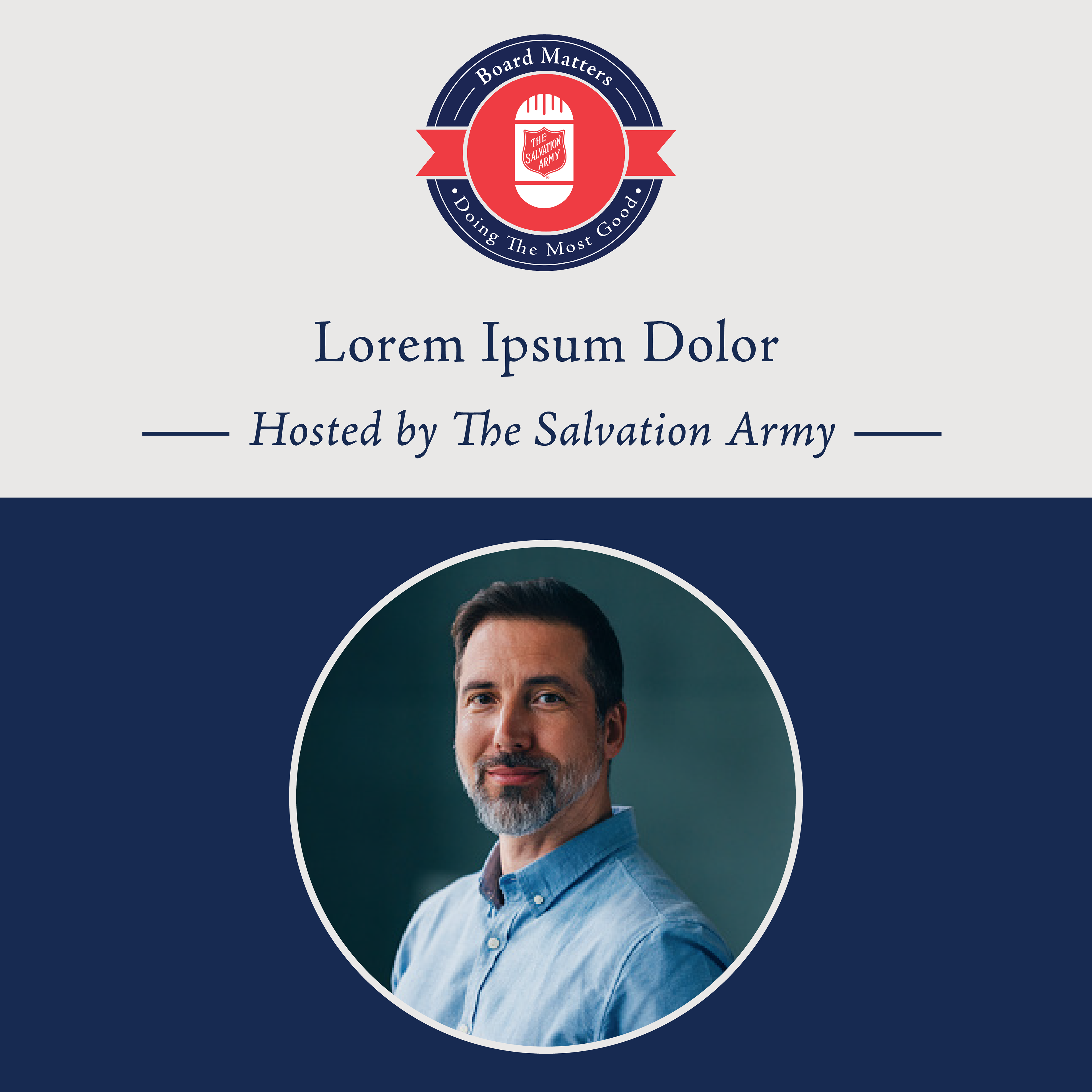
1080x1080 px
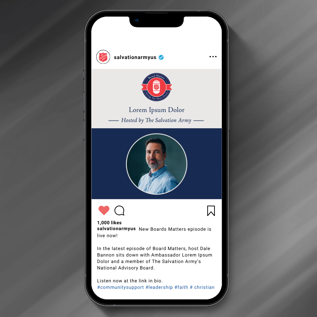
Video Frames
1920x1080 px